Source | vitalik.ca
Original title: "Vitalik: Against Overuse of the Gini Coefficient" by Vitalik Buterin
The Gini Coefficient (also known as the Gini Index) is by far the most popular and well-known measure of income inequality, particularly income or wealth inequality within a country, region, or other community. It is popular because it is easy to understand and its mathematical definition can be easily visualized with a diagram.
However, one can imagine that any scheme that attempts to reduce inequality to a single number has limitations, and so does the Gini coefficient. Even in the context in which it was originally used to measure income and wealth inequality across countries, it is limited, and when applied to other contexts (especially the world of cryptocurrencies), the Gini coefficient is limited. It's more obvious. In this article, I will talk about the limitations of the Gini coefficient and propose alternatives.
What is the Gini coefficient?
The Gini coefficient was proposed by Corrado Gini in 1912 to measure inequality. It is commonly used to measure income and wealth inequality in countries, although it is increasingly used in other contexts.
There are two equivalent definitions of the Gini coefficient:
➤ Defined by the area on the curve: Plot a function where f(p) equals the total income earned by low-income groups (ie, f(0.1) represents the bottom 10% share of total income). The Gini coefficient is the area between this curve and the line y=x, which is part of the entire triangle:
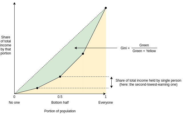
➤ Defined by the mean difference: The Gini coefficient is half the mean difference in income between all possible two persons divided by the mean income.
For example, in the graph of the above example, the income of four people is [1, 2, 4, 8], so there are 16 possible differences, which are [0, 1, 3, 7, 1, 0, 2, 6 , 3, 2, 0, 4, 7, 6, 4, 0]. From this, the average difference is 2.875, while the average income is 3.75, so the Gini coefficient=2.8752/ (2*3.75) ≈ 0.3833.
It turns out that both values are equal (proving this is left as an exercise for the reader)!
What's wrong with the Gini coefficient?
The Gini coefficient is attractive because it is a fairly simple and easy-to-understand statistic. It may not seem simple, but believe me, almost all statistics that deal with populations of any size are that bad, and often worse. Take a look at the formula as basic as standard deviation:
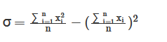
And the Gini coefficient is:
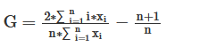
It's really easy, I promise!
So what's wrong with it? It actually has a lot of problems, and people have written a lot about various problems with the Gini coefficient. In this article, I will focus on an issue that I believe is under-discussed in the entire Gini field, but is particularly relevant to analyzing inequality in Internet communities such as blockchain. The Gini coefficient combines two actually very different issues—suffering from lack of resources and concentration of power—into one inequality index.
To understand the difference between the two problems more clearly, let's look at two dystopias:
Dystopia A: Half the population shares all resources equally, and the rest get nothing
Dystopia B: One person owns half of all resources, and everyone else shares the remaining half equally
Here are two dystopian Lorenz curves (nice diagrams like the ones we saw above):
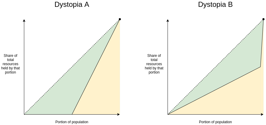
Clearly, neither dystopia is a good place to live. But they are not fit for life for the same reasons. Dystopia A is equivalent to giving each resident a chance to flip a coin. If it lands on the left, it will face terrible mass starvation; if it lands on the right, it will be the harmony brought about by peace and egalitarianism. If you're Thanos, you might like it! If you are not, avoid it with all your might. Dystopia B, on the other hand, is akin to "Brave New World": everyone has a decent good life (at least when taking a snapshot of everyone's resources), but it's served by a deeply undemocratic power structure. For the price, you better hope you have a good ruler. If you're Curtis Yavin, you might like it. If you are not, you should do your best to avoid it.
These two issues are so different that they deserve to be analyzed and measured separately. This difference is not just theoretical. The chart below shows the share of total income earned by the bottom 20% (which is an appropriate indicator of avoiding Dystopia A) versus the share of total income earned by the top 1% (which is close to anti-U.S. A suitable indicator of Utopia B) Contrast:
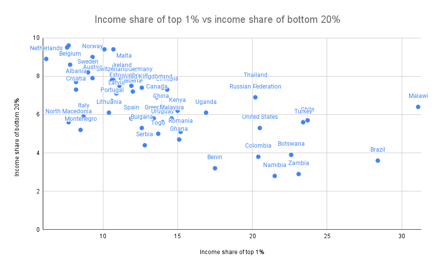
Sources: https://data.worldbank.org/indicator/SI.DST.FRST.20 (combined data for 2015 and 2016) and http://hdr.undp.org/en/indicators/186106.
The two are clearly correlated (the correlation coefficient is -0.62 ), but far from being strongly correlated (statistical authorities apparently consider 0.7 to be a lower threshold for "highly correlated", and we came up with a value lower than that). There is an interesting second dimension in the chart to analyze - countries where the top 1% earn 20% of total income while the bottom 20% earn 3% vs the top 1% earn 20% of total income vs the bottom What is the difference between countries where 20% of people earn 7% of total income? Alas, this exploration is best left to other more experienced and enterprising explorers of data and culture than I am.
Why the use of the Gini coefficient in non-geo-communities (such as the Internet or crypto-communities) is very problematic
Wealth concentration is a particularly important issue in the blockchain world, and one that deserves to be measured and understood. This is important to the entire blockchain world as a lot of people (and the US Senate hearing) are trying to figure out the extent to which cryptocurrency is truly anti-elitist and to what extent it simply replaces old elites with new ones. This is also very important when comparing different cryptocurrencies.
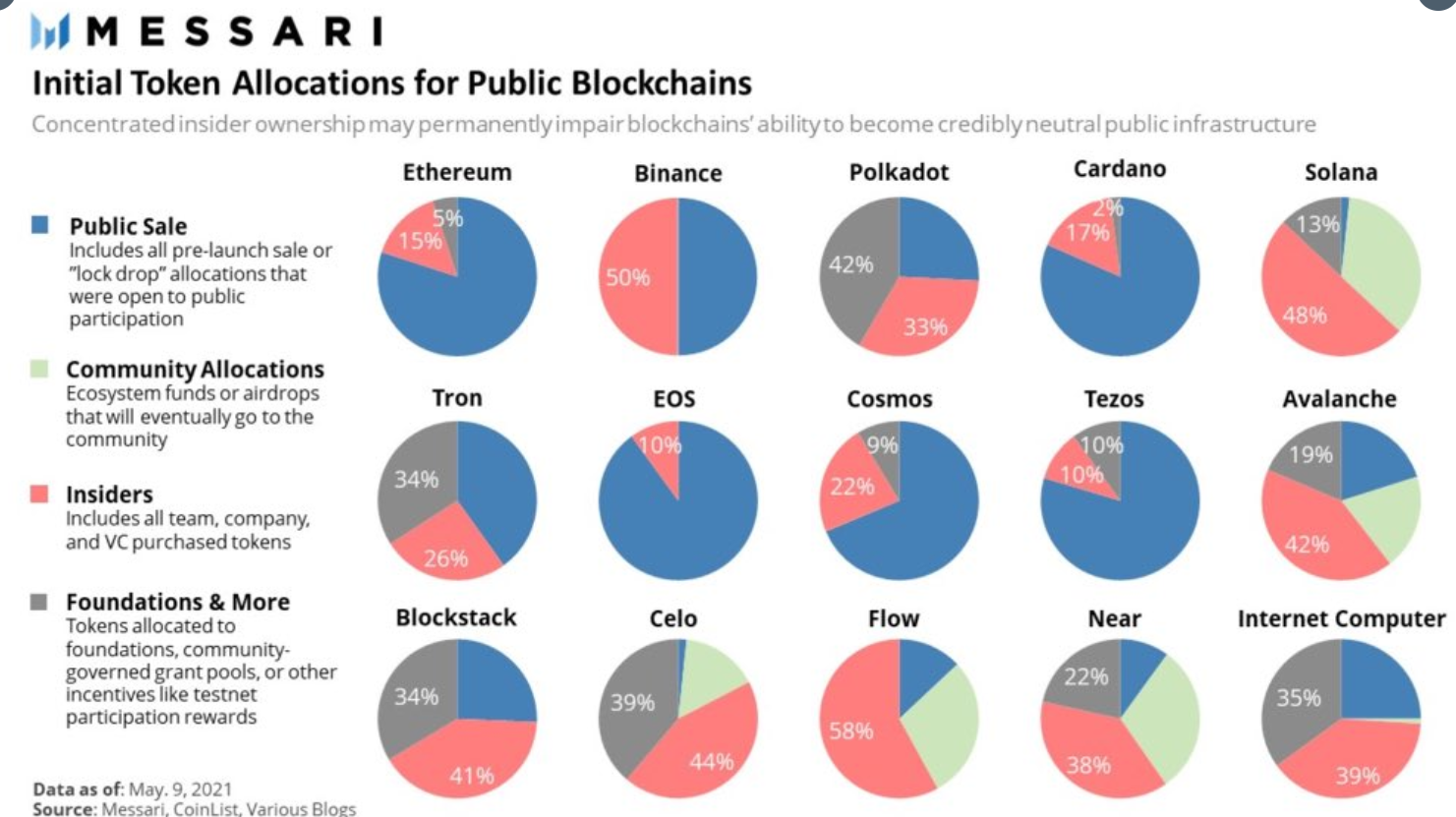
In the initial supply of a cryptocurrency, it is a kind of inequality that some tokens are directly distributed to specific insiders. Note that the numbers for Ethereum are slightly off: insiders and foundations should be 12.3% and 4.2%, not 15% and 5%.
Given the focus on these issues, it should come as no surprise that many have attempted to calculate the Gini index for cryptocurrencies:
Gini Index of Staked EOS Tokens of Interest (2018)
Cryptocurrency Gini Coefficient (2018)
Measuring the degree of decentralization in Bitcoin and Ethereum using multiple metrics and granularity (2021, including Gini coefficient and two other metrics)
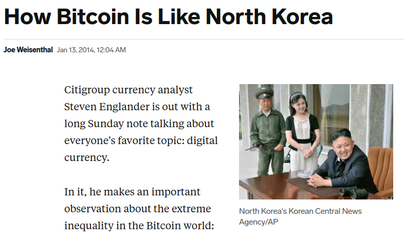
Nouriel Roubini compares Bitcoin's Gini coefficient to North Korea (2018)
On-chain insights into the cryptocurrency market (2021, using the Gini coefficient to measure centralization)
And much earlier than that, we had to deal with this blockbuster article from 2014:
Besides the general methodological errors that such analyzes often make (often conflating either income with wealth, or users with accounts), they also have a serious and subtle problem with using the Gini coefficient to make these types of comparisons. This question lies in the key difference between a typical geo-community (e.g. city, country) and a typical internet community (e.g. blockchain):
Typical residents of a geo-community spend most of their time and resources in that community, so the inequality measured in a geo-community reflects the inequality of total resources available to people. But in Internet communities, measuring inequality can come from two sources: (i) unequal shares of total resources received by different actors, and (ii) varying levels of interest in participating in the community.
The average person with $15 in fiat money is poor, and they don't have the ability to live a good life. The average guy with $15 worth of cryptocurrency is a hobbyist who opens a wallet for fun. It's healthy to have varying levels of interest; every community has its amateurs and full-time hardcore fans who don't have a life. So if a cryptocurrency has a very high Gini coefficient, but a large part of the inequality is due to varying levels of interest, that number points to a far less dire reality than those headlines suggest.
Cryptocurrencies, even those already highly controlled by plutocrats, are not going to turn anywhere in the world anywhere near Dystopia A. But a poorly distributed cryptocurrency can look like Dystopia B, and the problem is compounded if token voting governance is used to make protocol decisions. Therefore, in order to identify the most worrisome issues for the crypto community, we wanted a more specific metric that reflected something close to Dystopia B.
Proxy Metrics: The Problem of Measuring Dystopia A and Dystopia B Separately
Another way to measure inequality is to estimate the suffering caused by the unequal distribution of resources (ie, the "Dystopia A" problem). First, start with some utility function, which represents the value of having a certain amount of money. Many people use log(x) because it gives a very intuitive approximation of doubling one's income and is valid at any level: the increased benefit of going from $10,000 to $20,000 is the same as going from $5,000 to $10,000 $, or going from $40,000 to $80,000 is the same. Then, the resulting measure is how much utility is lost compared to if each person could only get the average income:
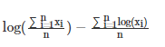
The first term (the logarithm of the mean) is the utility each person would get if the money were perfectly distributed, so everyone would earn an average income. The second term (mean of the log) is the average utility of the economy today. If you think of resources narrowly as things that are used for personal consumption, the difference between the two represents the loss of utility due to inequality. There are other ways to define this formula, but they all end up being close to equivalence (e.g. Anthony Atkinson's 1969 paper proposes a "equilibrium level of equitable distribution of income" index, in U(x) =log(x), it is just a monotone function in the above formula, and Theil exponent L is completely equal to the above formula in mathematics).
And to measure resource concentration problems (or "Dystopia B" problems), a good starting point is the Herfindahl-Hirschman Index (HHI for short), which has been used to measure economic concentration in industries :

image description
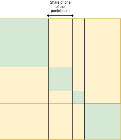
HHI: Green area divided by total area
It has other alternatives; Theil T index has some similarities, but also differences. A simpler, dumber alternative is the Nakamoto coefficient: the minimum number of participants that needs to add up is greater than 50% of the total. Note that this all these concentration indicators are very focused on what's happening near the top (and on purpose): a large number of amateurs with few resources contribute little or nothing to the index, while the top two players' Behaviors combined can have a very large impact on this metric.
Concentration of resources is one of the biggest risks to the system for the crypto community, but someone with only 0.00013 tokens doesn't prove they're starving, but that's the way of thinking with these indices. But even for states, concentration of power and suffering from lack of resources should be talked about and measured separately.
That said, at some point we have to look beyond these metrics. The harm caused by the concentration problem is not just a function of the size of the actors; it depends largely on the actors and their ability to collude with each other. Likewise, resource allocation is network-dependent: a lack of formal resources is not so harmful if those who lack them have an informal network to access. But dealing with these problems is much harder, so we really need simpler tools while we still have less data to work with.
Original link: https://vitalik.ca/general/2021/07/29/gini.html